Projects.

EchoFeather

In progress

You hear the bird. But what is it?

A bird call can be the only clue you get. EchoFeather explores how a recorded call or a photograph can turn that fleeting encounter into a possible identification.
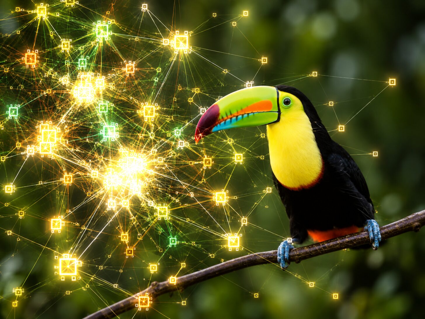
EchoFeather, a bird species identification project cover
A visual cover for the bird-identification project, currently in development.

A clear photograph is not always available, and a sound alone can be difficult to identify. I’m building EchoFeather around two ways to recognize the same bird: a photograph or a recorded call. Both paths lead to three possible species with confidence scores, making uncertainty part of the experience instead of forcing a single answer.

The project is still in development, with the next step focused on comparing its performance against BirdNET. I want to understand where each input helps and where it falls short. The goal is a useful identification someone can assess, with alternatives they can explore when the evidence is unclear.
Cache Eviction Research

When a simpler cache policy holds its own

When a cache fills up, what should it forget? I explored whether a learned policy could make better eviction decisions than simple rules. The most useful result was a tradeoff: on this workload, the extra complexity bought very little.

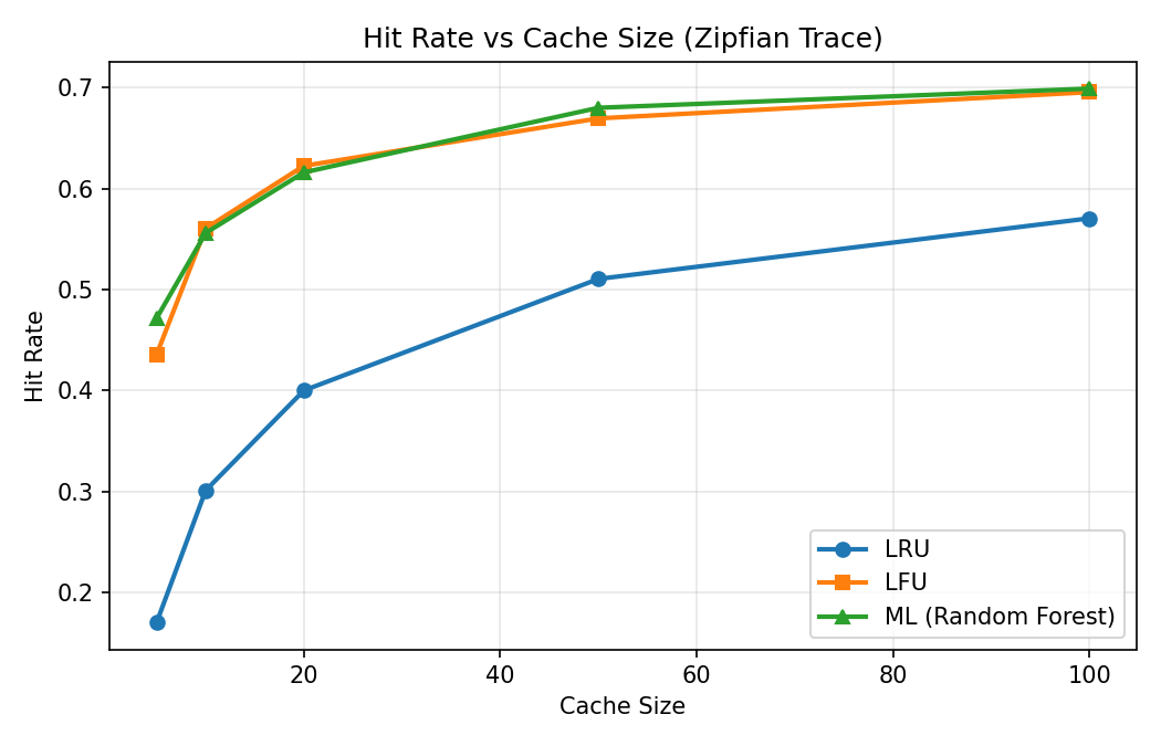
Chart comparing hit rate vs cache size for LRU, LFU, and ML-based eviction
The comparison that shaped the conclusion: frequency tracking and the learned policy achieved similar hit rates as cache size increased.

I compared recency-based and frequency-based eviction with a learned policy on a synthetic workload dominated by a small number of popular items. At a cache size of 10, the frequency-based policy achieved 56.1% hit rate versus 55.9% for the model, while being roughly 14,000 times faster per eviction decision in this experiment. A burst of sequential accesses also let me explore what happens when the usual access pattern is interrupted.

The result changed the emphasis of the project: extra model complexity needs to earn its place. Frequency tracking held up well when popularity stayed stable; shifting workloads remain a question for further testing. Because the learned policy uses oracle look-ahead features, this is an offline experiment rather than a deployable cache benchmark. That boundary matters as much as the score.

Transfusion Risk Checker

Learning to question a promising prediction

Could routine patient measurements help estimate transfusion need? Working with a demo dataset of 206 patients, I found that the harder problem was making the evaluation trustworthy. This project became a story about questioning the data before trusting the score.

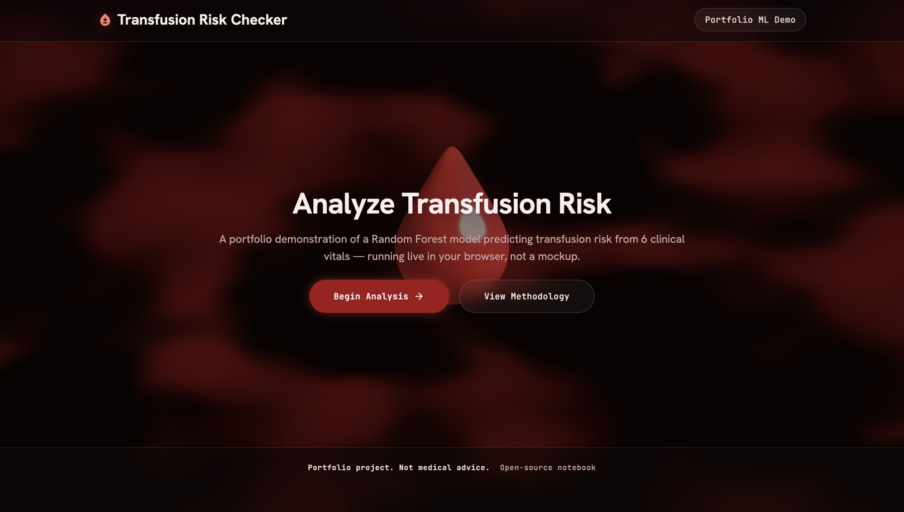
Landing page for the Transfusion Risk Checker, a portfolio ML demo predicting transfusion risk from clinical vitals
The browser-based demo makes the model’s output explorable. It is a portfolio experiment, not a clinical decision tool.

Working with 206 patients and only 14 positive cases, I uncovered two rounds of data leakage and a database join that multiplied rows. I traced the join to a missing row key, reduced the data to one row per patient stay, and excluded columns that defined the predicted outcome. The important work became making the evaluation trustworthy before comparing models.

I kept oversampling inside each validation fold and used stratified cross-validation. Average ROC-AUC scores of 0.791 and 0.812 did not justify a clear winner on such a small sample. I then exported the fitted model to run in the browser, where visitors can explore its predictions and limitations. The takeaway was to show uncertainty alongside the result, including unexpected changes as heart rate varies. This remains a portfolio experiment, not a clinical decision tool.

Making the journey from farm to buyer visible

For a farmer, preparing produce is only part of the journey. Our SIH 2026 team project takes on the uncertainty around what happens next: finding a buyer, following an order, and seeing its progress.

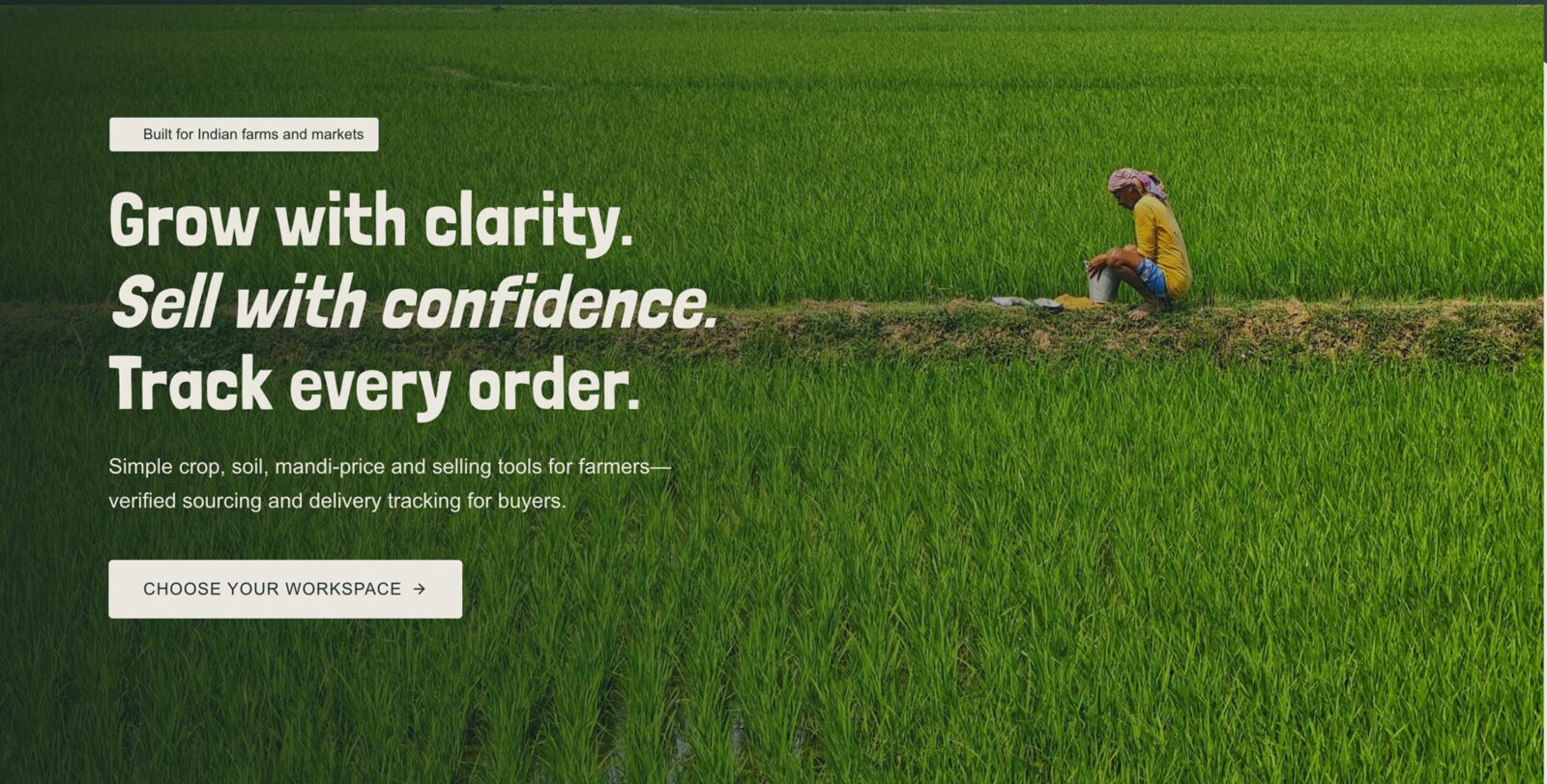
AgriOptima AI landing page, a smart farming platform for crop recommendations
AgriOptima’s public-facing landing page, leading into farmer and buyer workspaces.

The SIH 2026 problem statement, SIH26032, highlights farmers’ long waits, unclear procurement schedules, and uncertainty about procurement status. It calls for registration, arrival slots, live queues, notifications, and procurement and payment tracking. Our team’s work centres on making the journey from farmer to buyer easier to follow, connecting guidance, produce listings, buyer comparisons, and orders in one workflow.

Shared records help both sides see what has happened, while visible sources distinguish confirmed information from estimates. The current project includes farmer and buyer workspaces with order, shipment, inspection, and payment visibility. Slot booking, live queues, and notifications remain requirements of the brief rather than features claimed as complete here. The design question throughout is whether someone can understand the next step and the evidence behind it.

Task Receipts

A finished task deserves more than a disappearing checkbox.

A to-do list keeps your unfinished work in view. Task Receipts gives completed work a moment of its own: a focus session ends with a printable record of what you did.

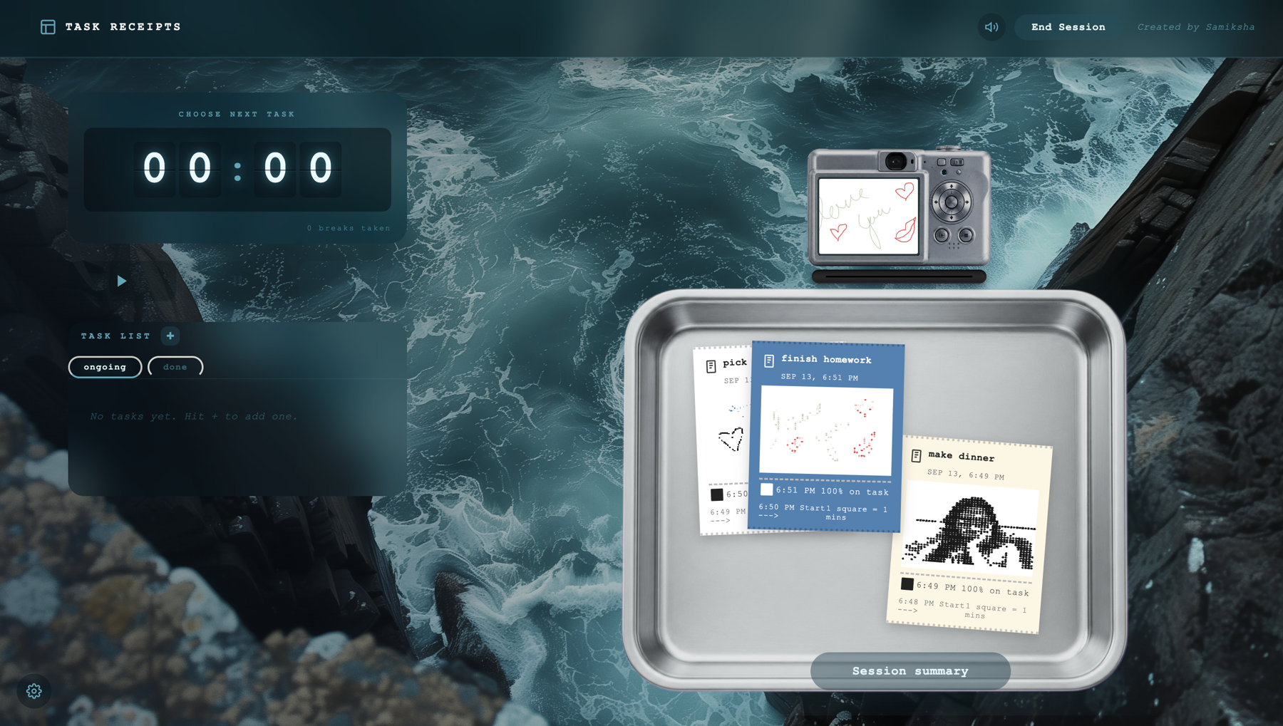
Task Receipts, a retro receipt-printer styled session and task tracker
The receipt-inspired interface turns a session summary into a keepsake.

When a task list keeps the focus on what is left, completed work can be easy to overlook. I built the experience around a focus session that ends with a printable receipt: track tasks, run the timer, and leave with a record of what happened. The receipt-printer idea carries through paper colors, dot-matrix filters, and themes, giving the end of a session its own visual identity.

The live tool turns a routine summary into something you can keep after the session ends. Its value is in how those small interactions fit together: starting with a task, staying with a timed session, and finishing with a clear record of progress. The design makes completion a visible part of the experience rather than letting it disappear with a checked box.

Anime Recommender

Less time choosing. More time watching.

An endless catalog can make choosing the next anime feel like work. Anime Recommender starts with viewer preferences to help narrow that decision.

Anime Recommender, a full-stack recommendation platform using AniList and MyAnimeList APIs
The recommendation interface brings preferences and anime catalog data together.

A large catalog is only useful if someone can find a starting point. I connected viewer preferences with live information from AniList and MyAnimeList, bringing discovery into one interface. The aim is to turn a broad catalog into a more relevant next choice, without making the viewer piece together information across services.

The resulting platform offers personalized recommendations grounded in those catalogs. The repository shows how the interface and data integrations come together, with user preferences guiding the experience. There is no public demo linked yet, so the code is the available way to explore the project and the decisions behind it.